![]()

COFFEE SHORT

For the love of coffee….
Brief :
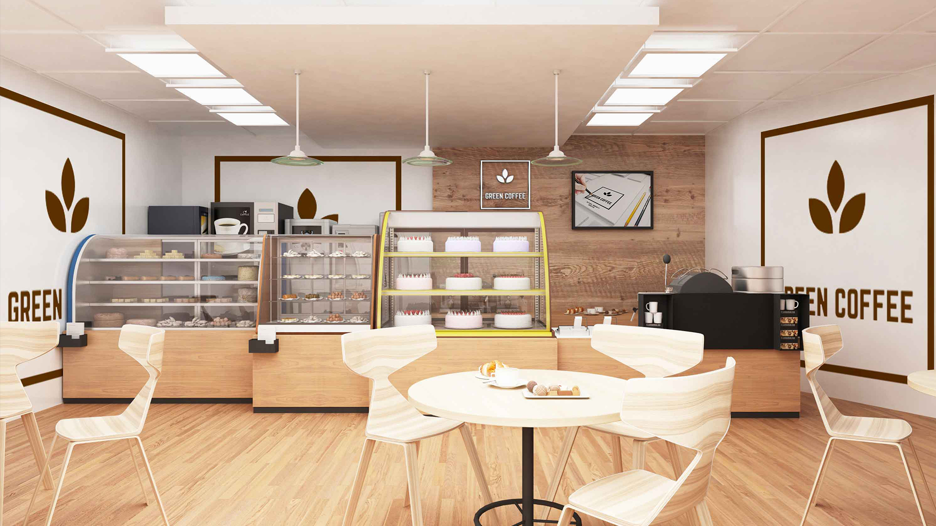
Position the brand that not only just serves a broader community but even strikes a chord with the community doing so.
Thought:
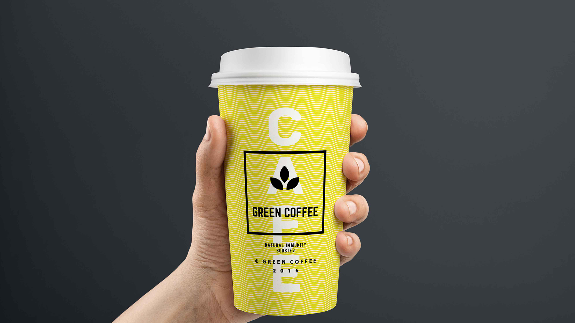
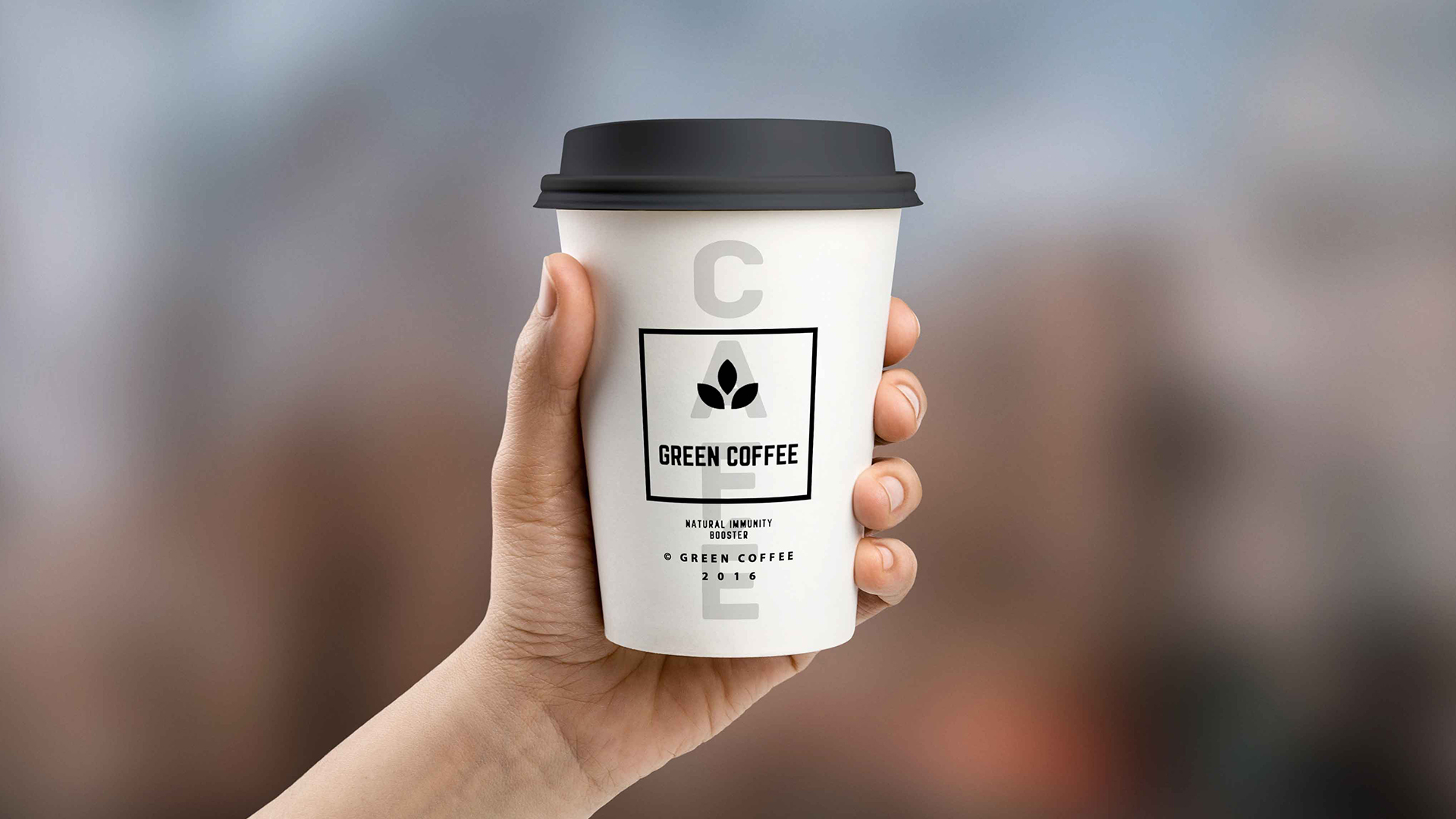
Minimalistic design for the logo.
Yellow = Optimism! Get the healthiest coffee in a large cup of positivity.
Brew your ideas as you sip.
Let coffee bring people together!
Execution :
Impact more with less – has always been our formula while designing for a brand. We recalled our basics about coffee. And we came across a very beautiful insight – Coffee is extracted from plant so why not design a logo that speaks about the root… the beginning… the birth of a coffee!
Now that we cracked the germ of an idea; we turned it into a minimalistic logo.
And this is what we have brewed!