![]()

Organic Garden

Straight from the farm to your shopping cart…
Brief :
Design a brand logo that only talks about what the brand believes in.
Execution :
We all are aware of this generic term – Circle of life, aren’t we?
So we thought what a perfect and a healthy circle of life would look like?
Realising that this fun insight was going well with the client brief, so we thought it’d be worth exploring.
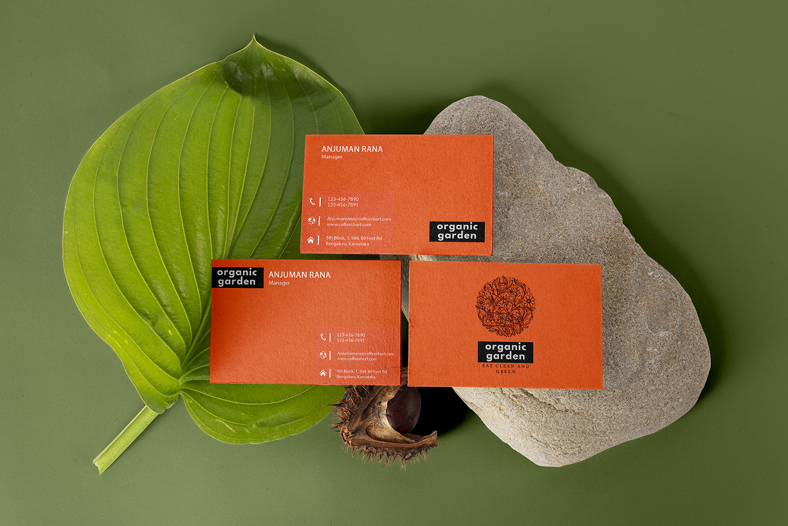
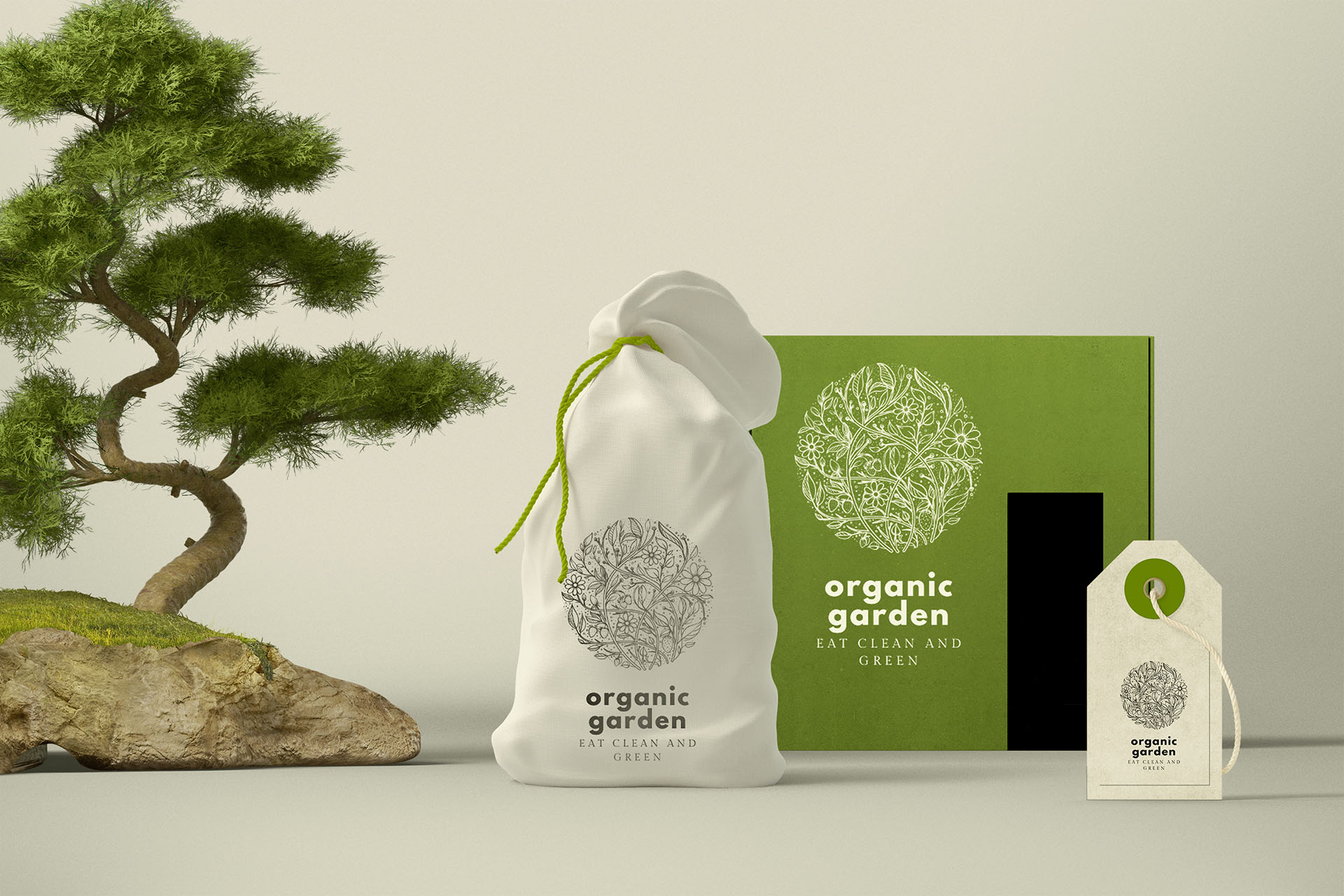
We relied heavily on the iconography while designing cause we wanted to showcase core values of the brand and we even wanted the brand logo to act as an extension of the brand name – Organic Garden.
And that is how we came up with the brand logo that is formed out of plenty of icons but rather than looking cluttered, it looks like a captivating circular doodle and we proudly call this a perfect and healthy circle of life.